Blending Photos
We are going to replace the background behind a subject, but we will also have the model take on the texture and characteristics of the wall.
Step 1: First, using an image of a rather grumpy looking dude from Photospin.com.
Step 2: Set up the layers palette as follows. First, copy of the background so remove the man from the background without messing with the Background layer. Next, create a new layer between the two with the model present and fill it with black.
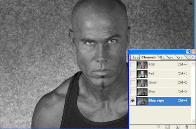
Step 3: Now we are going to conform a texture to the man's frame, and to do such I will be using a displacement map. I'll go ahead and create that now. If you are following along, go ahead and duplicate the Blue Channel in the channels palette.
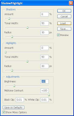
Step 4: In this step we are going to bump up the contrast of the new channel in a couple ways. First, use the Shadow/Highlights filter on the channel. My settings are shown below.
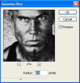
Step 5: As with most displacement maps, this will need some blur applied. Apply a Gaussian Blur as seen here.
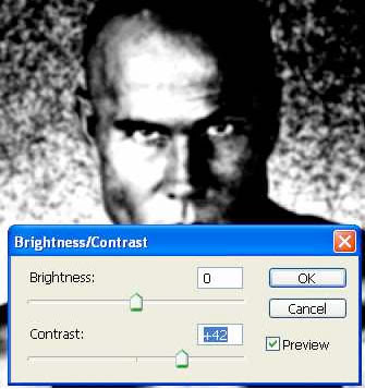
Step 6: In step-6 bump up the contrast a bit on the channel. My settings are seen below.
Step 7: Once satisfied with the displacement map, save it to a new file, name it, and save it to your hard drive.
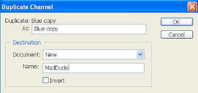

Step 8: Close the map once it has been saved. Return to the original image and delete the Blue Copy channel. You won't be needing it any more.
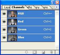
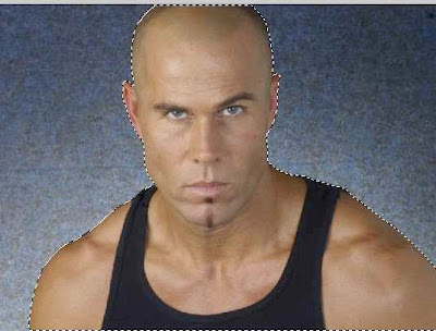
Step 9: Return to the layers palette. Using your favorite selection tool, select the man separate from the background. In this step used the magic wand tool with Add To Selection turned on, selected the background, then inverted the selection.
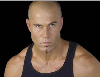
Step 10: Once your selection has been made, click the Add a mask icon on the bottom of the layers palette. The background will disappear to reveal the black layer beneath.
Step 11: Now open a background image that is fairly close to the size of the original photo. In this case I am going to use a stone wall (or perhaps a stone path) as my pattern of choice. This image is also available at Photospin.com.
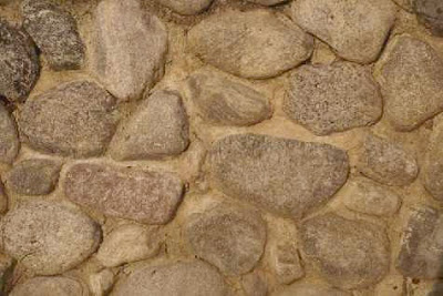
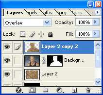
Step 12: Make a copy of the stone image and paste it into a new layer beneath the top most layer with the man present, but above the black layer. Don't worry if the image is smaller than the original as seen here: we can fix that in a bit.
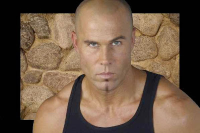
Step 13: Duplicate the wall layer and place the new instance of the wall at the top of the layer stack.

Step 14: For this top layer, go ahead and use the Edit => Transform => Scale function to increase the size of the layer so that the entire image is covered.
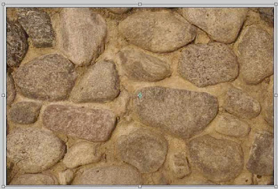
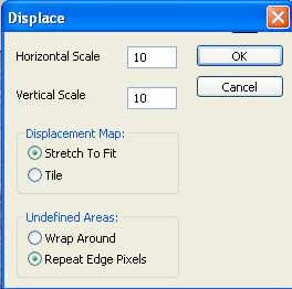
Step 15: Command/Control+Click the mask on the man layer to generate the selection again. Run the Displace filter with the settings seen below on the selection.
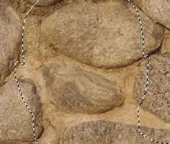
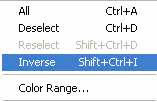
Step 16: Select the inverse and hit the Delete key. This will wipe away the extra stone, leaving only the man covered. Change the Blending Mode for this layer to Overlay. The results can be seen below so you can check your progress.
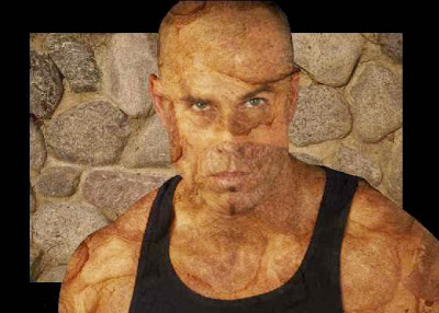
Step 17: Now use the transform tools to increase the size of the stone layer behind the man.
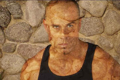
Step 18: Duplicate the top layer and change the blending mode for the new layer to Soft Light. This just helps enhance the features of the stone on the man.
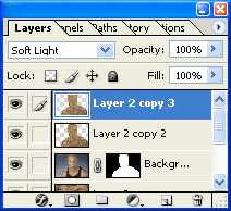
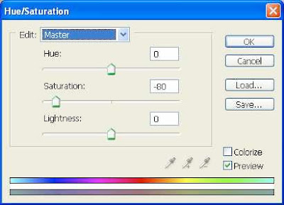
Step 19: Adjust the Saturation of the Soft Light layer, decreasing the Saturation to -80 or so.
Step 20: Reduce the saturation of the Overlay layer also, but only adjust this to about -60.
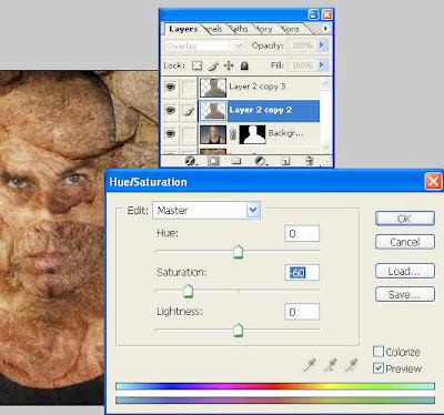
Step 21: We can still tone this down a bit further. Create a Hue/Saturation adjustment layer just above the man.
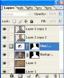
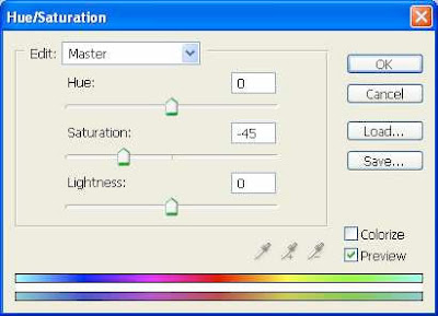
Step 22: You should be getting a fairly decent blend of the subject with his background.
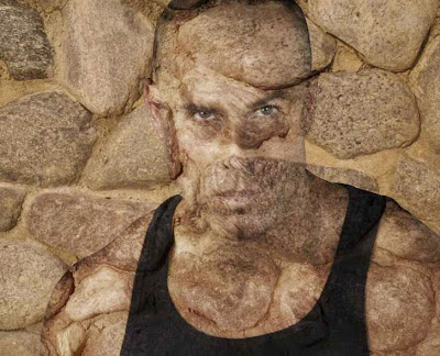
Step 23: As a result of using the Displace tool, some stretching of pixels has occurred on the stone-man layers. If this is the case, first select the stone-man overlay layer, and clean up these stretch marks around the eyes, lips and edges by taking samples of unstretched stone with the Healing Brush and applying the pattern to the stretched areas.
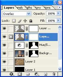

The image shows the man after the clean-up process.
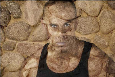
Step 24: Last things to do is reveal the eyes and lips again. To do this simply create masks for the stone-man layers and paint over those areas with Black in their respective masks.
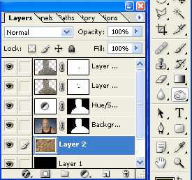
Step 25: Final thing, some shadow would do nicely to make him stand out from the background just a bit. Using the Burn Tool on the stone background and running it around the man's shoulders and head should work nicely. My Burn Tool settings are seen here:

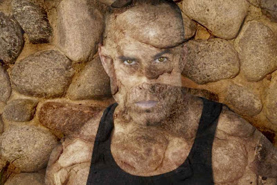
The final image is seen here:


1 Comments:
I am very grateful you did share your knowledge here. It is an excellent post
By Robert Smith, At
June 28, 2018 at 9:17 PM
Post a Comment
<< Home