I am using a technical collage image from Photos.com.

After perusing their images, I have chosen another that I’d like to merge with the first. I am going to stay with the tech them, and this next image should work nicely.

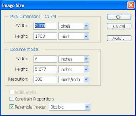
There a few ways we can merge these two images, and we will explore a couple. The first I am going to try is Apply Image. In order for Apply Image to work, the Pixel Dimensions of both images have to match exactly. Check the size of the first, then resize the second to match it.
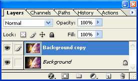
In the first image, duplicate the Background layer.
Now go to Image>Apply Image. Set the source to the second image, with the rest of the settings as seen below.
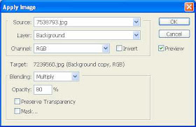
Before you accept the Apply Image command, take a look at the document. It should look similar to, if not identical, the image below. For my tastes this is a bit dark.

In the Apply Image dialog box, which should still be open, change the Blending Mode to Overlay and set the Opacity to 80%. The results are seen below: do NOT close Apply Image yet. We will do that after we find a good mix.


Now that is looking better, but I think there is still far too much of the original image showing through. Back to the Apply Image dialog box: set the Blending Mode to Screen, but bump the Opacity up to 100%. Let’s take a look now.


Now that is much better… you can actually see both images in the meld, across the entire document. Go ahead and click OK to accept Apply Image.
So, what would happen if we add yet another collage to the mix? And what if, instead of using Apply Image, we merged this new background to the others via simple layer blending modes?
Again, I’ve selected another image from Photos.com. This is still somewhat technical, but in an entirely different way and feel.

For the first attempt at blending, copy and paste the new background into its own layer in the original document. Let’s start with the Hue blending mode.
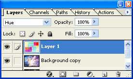

T colors seem to divide the existing image into chunks.
Ok, rather than continue messing with the background at this point, I’m going to change gears a bit and add a few other elements: namely a person and some text. I apologize that I’m bypassing explaining this step, but that would carry on for a few pages. If you are familiar with my past tutorials, then I’ll bet you can figure out exactly what I did… if not, I will try to explain at a later date.
Anyway, after inserting another photo, some text layers, and manipulating each a bit.
I have come up with this:

That is ultra busy… Not that busy is bad in this instance, but it is a bit overwhelming to my sensibilities. Let’s see if I can’t tone this down a hair. The first thing I want to get rid of are the offensive colors. Pea green… looks good in soup, but not very appetizing here. I can do this in a few ways as well, but we are experimenting, right? Select that blocky color layer in the Layers palette.
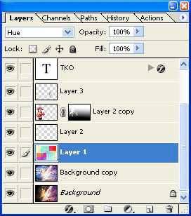
Let’s run Match Color, using the image we used in the first Apply Image application. I’m using the settings seen below.
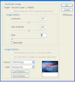

To tone this down even further while keeping the high-voltage tech them going, I’m going to save a copy of this image as a jpeg, then continue working with the new jpeg rather than this huge psd file. Keep the psd file open though… I’ll show you why in a few seconds.
With the new jpeg version open, I’m again going to run apply image, selecting the same image as before as the source, with the settings seen below.
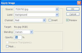
When you accept the Apply Image settings, your image should look something like this.

Much of the color is taken away, and the text and woman are a bit difficult to see… but I like the background far better this way. So how do we get the woman and the text back up to par? Simple… just return to the .psd image and drag the layers you want to enhance into the new document. Use the move tool to slide them in place over the original positions.
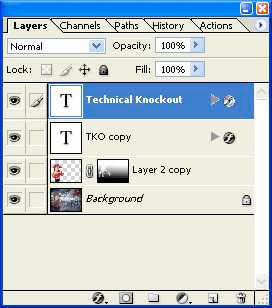
When done, the areas I’d like to be subdued are subdued, and those I want to enhance are clearly visible again.

No comments:
Post a Comment